10.25.2011

"New Rules of Work" Letterpress Posters by Division of Labor (SF)


"New Rules of Work" poster series letterpressed by Tribune Showprint, set available online here.


"New Rules of Work" poster series letterpressed by Tribune Showprint, currently sold out.


"Grocery Signs" hand lettered signs on butcher paper, available online here.


Division of Labor is a creative studio based in San Francisco, California, that's done some really impeccable work for some really big names.  They have a ton of campaign and video work that's pretty well known, but their prints and posters are also cool as well.   And, with a logo designed by the great Mikey Burton, how can this studio NOT be awesome?  Check out their online store for some cool poster prints currently available.

10.24.2011

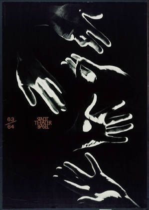
International Typographic Style (Swiss Style) by Armin Hofmann


Swiss graphic designer Armin Hoffman led the avant garde design movement of International Typographic Style (aka Swiss style) as the head of the graphic design department at the Basel School of Design alongside Emil Ruder during the 1950s.  Swiss design elements have stood the test of time as a dependable approach to design in a way that is functional and appealing.  Solid grid-work and sans serif is something that no designer can go wrong with, where Hoffman's posters here demonstrate how effective simplicity can be.

"He is a rare bird. a daredevil driver, a mountain climber, a teacher par excellence, and a guru.  Yet it is difficult, really, to pin him down." -- Paul Rand

Image credit to MoMA

Music Goodness: Phantogram and Gui Boratto


It's Monday again -- which means that I'll be turning my sweat into cold hard cash, caffeinating away everything on the news, and finding a few playlists to batten out weekend withdrawal. The Flyergoodness team will also be poolside at the Mondrian in Hollywood tonight to catch tonight's SBTRKT show.


The production and chopped up sampling on the new Phantogram had me googling around to see if Star Slinger had his hands up in this. It's a bit more distilled and poppy, but I dig where their sound is going.


Erik pointed me at this Gui Boratto track that's got me hooked. There's lots more where this came from on Spotify and Youtube.


10.21.2011

Reader S.O.W. -- Marc Bessant


This week's Reader Submission of the Week: Marc Bessant. As the creative head of design at Real World Studios over in the UK,  he puts out bold work and isn't afraid to try new things.  On a brief tangent, from  reading Marc's bio on his site I felt a really genuine vibe just from the way he portrays his online image.  Going through so many portfolios and artist sites, it'e really interesting to see how people craft their online perception through their own words in combination with their work.  Usually being casual, honest, and humorous does the trick.

And please keep keep KEEP sending us designs at Flyergoodness@gmail.com--we need them.  Now.

10.20.2011

Geometric Movie Posters by Yannis Naamane


Yannis Naamane is an illustrator and graphic designer based out of Strasbourg, France who has a minimalist approach in portraying films.  I don't know how everyone else sees the trend of minimalist movie posters, but as popular as they are, I think they're a quick and appealing way to convey a designer's style given how many ways you could sum a film up into one simple visual.  Overall, it's a good thing to see the amount of engagement going on, especially with the attention that some of the fan art has been getting lately on the web.