Another book I picked up and scanned some pages from with design plates made by industrial designer Christopher Dresser (1834-1904). His work derives from a broad range of influences including Gothic, Chinese, Islamic, and his botany background in creating Victorian ornamentation originally intended for ceilings and walls of Victorian homes.
Showing posts with label 1800s. Show all posts
Showing posts with label 1800s. Show all posts
4.08.2013
8.20.2012
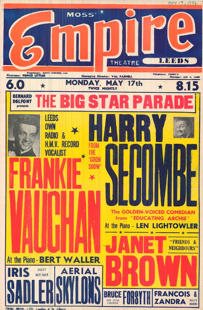
Leeds Theater Playbills
A follow-up post from one of our more popular posts on Vintage Circus Posters, here are some more Leeds Theater Playbill posters spanning from the 1800s-1900s. Lately in new brand design work I've been seeing the use of a vast assortment of fonts all bunched close together, like in print magazine ads and pizza boxes and how there is a way to make it all work without looking too cluttered and all over the place--spacing, contrast, and size variation.
Tags:
1800s,
1900s,
playbill,
theatre poster,
typography
4.28.2011
Vintage Houdini Posters
Caught this excellent post by the good folks over at Beautiful Decay that featured some rather unusual pieces that you don't see everyday. They posted some really nice old school posters based on houdinis from the late 1800s in line with a current gallery exhibition going on over at the Skirball Cultural Center (which I should probably go to). Some of them are odd, yes, but I am really liking the different ways the word "houdini" is created in these with outlines, serifs, curves, italics, and kerning.
Additional image credit to Holy Taco
5.20.2010
Vintage Circus Posters and Flyers from the Leeds Playbill Archive
The Leeds Playbill project is an online archive of some of the oldest circus posters and vintage playbills to date. Authentic circus ads from this collection were originally produced between 1860-1890 in Leeds, West Yorkshire in the UK, and come from numerous theaters. All of these posters demonstrate excellent typography work through antique press printing, especially given the copious amount of text that you wouldn't normally see on posters today. The kerning and alignment of the type in these posters is what makes the massive wall of text bearable, with the high contrasts and colorways providing for an overall aesthetic appeal in combination with a mixture of flashy fonts.
Generally, using so many different font types on a single page would disagree with principles of good design, but because of the way the headlines are laid out (and also the time period), these playbills work in grabbing your attention. Upon a quick scan from top to bottom for each of these playbills, you're able to obtain the necessary information regarding the theater event, with the body text filling in the negative space just enough to give the posters a fuller look.
LINKS:
Leeds Playbill Gallery
Woodtyper blog post on Leeds Playbills
Subscribe to:
Posts (Atom)


