12.30.2010

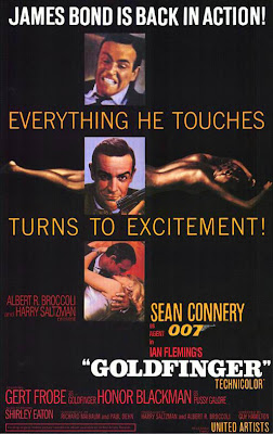
James Bond Film Posters


Everyone loves the James Bond franchise for the action, explosions, girls, cars, and exotic scenery. Did I already mention for the girls.  Besides the girls, the posters for the movies are always able to capture the James Bond essence, usually consisting of the actor of the time playing James Bond in a suit holding his pistol out in a suave and powerful stance with the accompaniment of one or more women.  The older posters have some almost unorthodox text placement, yet I can't say they don't work.

via James Bond Multimedia

12.29.2010

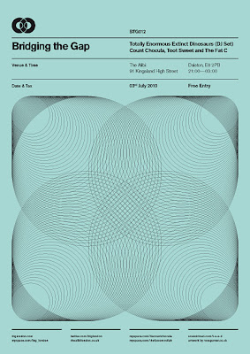
Simplicity is Bold by Ross Gunter


A very well done set of poster series titled 'Bridging the Gap" is a personal project by Ross Gunter for a night club in London.  Its not often that you come across club promotional posters like these, as Ross emphasizes on simple bold and attractive designs inspired from old international typographic style and old letraset catalogs and cassette tape covers.  The linear layout and spacing between text is just pretty amazing.

Follow him @rossgunter

12.28.2010

Typography and Illustrations by Marian Bantjes


Marian Bantjes is a hyper-talented graphic artist working near Vancouver.  She's amazing at combining lettering with organic illustrations, as well as making some badass patterns, magazine covers, and of course, gig posters.  Check out her site for much, much more and to check out some of her work available for purchase.