Showing posts with label iso50. Show all posts
Showing posts with label iso50. Show all posts
3.08.2011
Gorgeous Poster for Tycho's SF Show
Tags:
clean,
graphic design,
iso50,
san francisco
9.17.2010
Cool Flyer for Tycho's Upcoming Live Shows
Tycho's designer alter-ego ISO50 made this pretty cool flyer for his upcoming shows in Seattle, New York and Toronto. My mind was blown away at the Ghosly A/V Showcase a couple months ago, I highly recommend checking him out if you can. More info here at ISO50's blog.
Tags:
gig flyer,
graphic design,
iso50,
show flyer
1.22.2010
IS050 (Part V)


 Some of ISO50's older prints from his golden archive of design.
Not much needs to be said that we haven't already said about Scott's work, other than that you can stare indefinitely into his stuff and get lost in the depth that he puts into some of his really detailed pieces.
His blog is an addictive habit that is a must-surf on a daily basis.
He does the sounds, he does the visuals--the only thing he has left to pioneer in is smell.
our older posts on him h e r e .
+ a bonus print for kicks.

11.04.2009
ISO50 - Toronto
Scott Hansen aka Tycho aka ISO50 has designed another beautiful poster for his next gig in Toronto. If you're anywhere in Canada on the 20th I highly recommend you see his live AV set at the Toronto Art Show After Party.
9.09.2009
ISO50 - Clearwater

An older item I dug up from my ISO50 folder. Works well as a poster or more of a complement to a dorm room or pub -- but its pretty cool how simple the execution is (justified type over the bottom of image) but how well it turns out.
9.08.2009
ISO50 - Austin
 A poster for a Tycho gig in Austin a couple weeks ago -- as usual with Scott Hansen, the type is always perfect (and usually at the bottom) but the illustrated diver among the jellyfish swarm convey just how magical and wondrous Tycho's music style really is.
4.28.2009
6.30.2008
ISO50


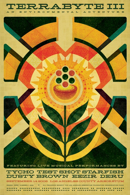
For those of you not familiar with ISO50/Tycho/Scott Hansen, he's well known for designing beautiful cd covers, concert posters, and a few flyers. Most of his work is done as a poster (as is the last image in the post), but his flyers evoke the same natural/vivid color schemes with a contrast of an organic feel with geometric shapes that just reach out to your eye. This is just a concise sampling of his work, I really recommend his blog to check out his extensive portfolio of posters.
Subscribe to:
Posts (Atom)


