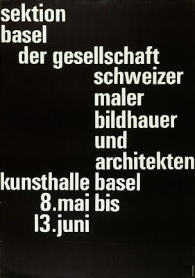
Looking at a lot of ads and billboards these days, you can easily trace traditional swiss grid design in the type work, where the perfect alignment and placement of text on a print is part of the overlooked design composition. With the right amount of kerning, margins, and formation of lettering, a design can go from zero to hero, and Emil Ruder here does just that.
Emil Ruder was born in Swtizerland and studied Bauhaus and typography at the Zurich School of Arts and Crafts and later became a typography instructor.
“Typography has one plain duty before it and that is to convey information in writing." -ER


1 comment:
i liked this blog it has very nice information ....
office stationery
letterhead printing
Post a Comment