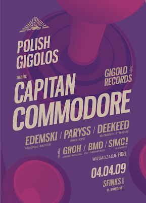
Dice Twice is a graphic design crew based in Gdansk, Poland. I gather that they specialize in club/event flyers, which is cool. Their Aquasky poster is just so amazing with all of the repetitions and angles going on, and especially the way they did the letter A. Looking through their work, I noticed that they like to use a thicker margin space to separate the content inside the canvas from the border, which leaves more empty space--and it really works in a different but interesting way.


No comments:
Post a Comment