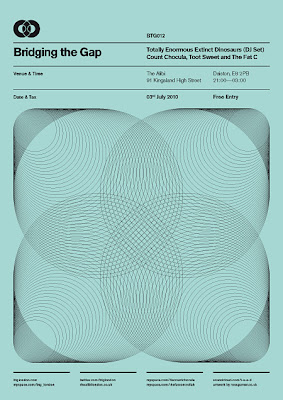
A very well done set of poster series titled 'Bridging the Gap" is a personal project by Ross Gunter for a night club in London. Its not often that you come across club promotional posters like these, as Ross emphasizes on simple bold and attractive designs inspired from old international typographic style and old letraset catalogs and cassette tape covers. The linear layout and spacing between text is just pretty amazing.
Follow him @rossgunter


5 comments:
A very well done set of poster series titled 'Bridging the Gap" is a personal project by Ross Gunter for a night FM WhatsApp club in London. Its not often that you come across club promotional posters like these, as Ross emphasizes on simple bold and attractive designs inspired from old international typographic style and old letraset catalogs and cassette tape covers. The linear layout and spacing between text is just pretty amazing.
I love the creativity in Ross Gunter's "Bridging the Gap" poster series! The blend of bold designs with vintage typographic inspiration sets a unique vibe perfect for a nightclub. Speaking of unique experiences, have you tried Snow rider ? It’s an exhilarating game that also uses stunning visuals to create a memorable atmosphere. Both the posters and the game showcase how impactful design can enhance enjoyment.
Simplicity is Bold by Ross Gunter emphasizes the power of minimalism in creativity. It suggests that stripping away excess reveals true essence, allowing authenticity to shine. This concept resonates well with moto x3m, where straightforward design meets thrilling performance in a seamless experience.
Ross, great article! Simplicity truly is powerful. It cuts through the noise. This reminds me of Infinite Craft – starting with basic elements, you build complex creations. The best designs, in both life and the game, are often elegantly simple, hiding immense possibility. Finding that core essence is key!
Simplicity is often underestimated, but as Ross Gunter illustrates in "Simplicity is Bold," its power can reshape our perspective. A clean design and straightforward messages allow ideas to shine through. Similarly, enjoying games like uno online emphasizes the beauty of simplicity, where the fun lies in straightforward rules and interactions. Whether we design or play, embracing simplicity can lead to bold outcomes that resonate with others.
Post a Comment