Pepsi Font
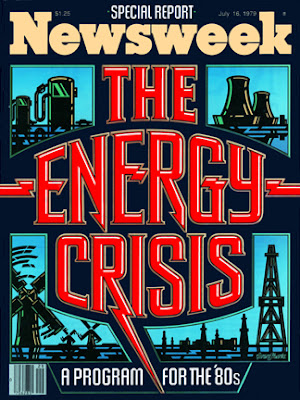
Kind of surprised that we haven't done a post on him yet, but Gerard Huerta is one designer with a heck of experience under his belt. Born and raised in Southern California, he graduated from the Art Center College of Design and did some logo work for some highly recognizable brands like Pepsi (Not this Pepsi), AC/DC, Rolling Rock, Swiss Army brands, Ringling Brothers, et cetera et cetera. Additionally, hes done mastheads, magazine covers, and really great letter form and illustration for other big brands that I'm sure you have all come across.
I think its safe to say Gerard has played a significant role in developing the visual brand perception for these companies that are very relevant to contemporary society. Everyone can now say thank you to Gerard for making life better.
Good Friday.
Don't forget to send in your work to us at Flyergoodness@gmail.com!


