6.30.2008
Stefan Sagmeister
Seriously, what kind of flyer blog would this be if I didn't cite the classics? Stefan Sagmeister (a very articulate designer, author, and lecturer) puts out some abstract ideas behind his work. His pieces bear his signature handmade arts+crafts style, which uses simple elements and combines them into an eye-catching concept. For example, the Adobe Awards poster employed the use of 2500 coffee cups to make the image.
Tags:
abstract,
stefan sagmeister,
unconvential
ISO50
For those of you not familiar with ISO50/Tycho/Scott Hansen, he's well known for designing beautiful cd covers, concert posters, and a few flyers. Most of his work is done as a poster (as is the last image in the post), but his flyers evoke the same natural/vivid color schemes with a contrast of an organic feel with geometric shapes that just reach out to your eye. This is just a concise sampling of his work, I really recommend his blog to check out his extensive portfolio of posters.
6.28.2008
Call To Mind + Streetlife
Design credit goes to David Airey. Done for music events in Edinburgh and Glasgow, the type is very straighforward and to the point, simple enough to get right to the information but still eye-catching.
6.27.2008
Family Club
Clean, Simple highlighted text with detailed backdrop. Backside looks sharp despite the Illiadic amount of information. By Visiophone for Family Club in Madrid.
The Take Over at Love NYC
Consistent eye-catching colors that are clean and not forced, and the thing just looks textured. After much investigating, can't figure who's responsible for this piece. Done for a launch party at Love. via Showtrotta.
Urban Medium
Design by UrbanMedium (Heavy Ammunition). Melting pot of Star Wars icons and other infamous figures. Really wish there was the Che-Trooper, though.
6.26.2008
Atskalunas
Type so thick you want to bite into it. Design credits go to Romanas Orlovas (AROMA). via FlyingFlyer.
Tags:
bar,
concert,
lithuania,
typography
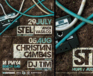
La Playa Beach Bar
By Sebdesign. Transparent text outlining to add to the hi-textured look. Don't even know what or where, but I want to be there.
The Pharcyde at Detroit Bar
Produced by B! Productions. Got this for a show at Detroit Bar a little while ago. Simple Clean Layout. Great typography. Clean Read.
Tags:
bar,
club,
concert,
orange county
Subscribe to:
Posts (Atom)